Showing posts with label design. Show all posts

Friday, March 4, 2011

Vintage Inspiration


I like to look at a lot of vintage ads when I need inspiration for something at work, so of course when I'm told to do a 50s themed ad for an ice cream parlor I'm going to look for 5os Ice Cream ads.

I stumbled across this one and loved the colors, so I decided to design the one I'm working on like this vintage one. This is what I was told to do, so I'll be designing another one, but I needed to do something fun this afternoon!

Ed Emberley

I love Ed Emberley's illustrations, so of course I double love them when they consist of birds and owls. I'm sort of craving getting that little one on the perch as a tattoo, but I'm so indecisive about things that are permanent, haha.
I love these serious little fellows right here as well.

Been looking at his artwork all day trying to draw inspiration from his work for an ad I'm putting way too much effort into. I know that putting a lot of effort into my work is a GOOD thing, but 9/10 times the ones I work the hardest on don't get used and I don't paid enough for this, haha.

Saturday, November 6, 2010

Josh & Genevieve

Yesterday was Josh and Genevieve's 1 year anniversary.
She wanted to make a coloring book to give to him and asked people to contribute.

Wednesday, November 3, 2010

Gift Guide Ads! (aka I hate spot color ads!)


Blogspot still won't work on my home computer, so it's been a while since I've had a chance to update. Currently working on ads for the Christmas Gift Guide. Spot color drives me nuts.

Wednesday, October 6, 2010

Fall Dining Guide Pt. 4


The top ad is from yesterday from before I had any of the images for this place. The bottom image is from today. They requested it be designed like the IHOP ad from our last dining guide. I made it similar but took some liberties.

Fall Dining Guide Ads Pt. 3

Or the edition I like to refer to as "The Client From Hell".


I loathe working on ads for Laughing Sheep Farm and Restaurant. Not only does the mere idea of their food make me a little queasy, the owner is a sadist. She hates everything I design. She will tell me it only needs a few changes which, in summation, ends up being the whole ad. She always sends a novel to put in one small ad, and then tells me it's too crowded. She hates the colors I use, etc, etc.

THIS specific ad, I have already redone FIVE TIMES.

If I didn't think it would cost me my job, I'd tell her to stuff it. Or at least tell her that we gladly accept ready-made ads from our clients.

Tuesday, October 5, 2010

Fall Dining Guide Ads Pt. 2


Fall Dining Guide Ads Pt. 1


This guy asked that he have the coolest ad in the new dining guide....
Not sure I achieved that, but I still think it's pretty cool.

The original was shot at night so it didn't have a ton of color in it. I went ahead and made it black and white, added a golden color to the windows and their light on the sidewalk. Made the sign neon green because he likes the neon green of his menus, and added some stars, etc.

Tuesday, September 14, 2010

Fake Coupons

I haven't really felt like posting my work-work lately... mostly most of it has not been posting worthy, but here is a "coupon" I made today. Work is such a drag lately!

Friday, August 20, 2010

Mi Vida Logo (Honey Depot).


Even though I turned in the ad yesterday, and I'm pretty sure it's going to be liked by the business based on Christina's reaction, I got a random idea for this design earlier this afternoon. Haven't done much of anything today. I just got done re-designing an ad for a business I hear is very particular about their design. They've apparently been using the same ad for a really long time and I basically did the exact opposite...as per my boss's request... we'll see. I'm just glad that as a designer I don't have to deal with the public and that everyone I work with seems to think I'm ridiculously talented, haha. :)

Thursday, August 19, 2010

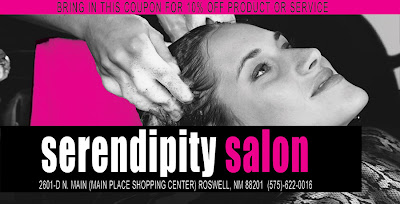
Pretty In Magenta and Black?

I'm only allowed to use black and magenta on the coupon for this salon. Would it be pushing it if I just made it look like the Pretty In Pink cover?

....probably, hahaha.


Even MORE fake coupons!


Thursday, August 12, 2010

More mock coupons!


There are a bunch more, but these are some of my favorites I've done this week.

Wednesday, August 4, 2010

Work work work

I sort of like this. Wish this was the kind of thing I got to do at work every day. In fact, they probably won't even let me use this. Wah wah wah.

Sunday, April 25, 2010

Packaging.


Designed the packaging labels for my skulls lastnight. The same basic format as my gun packaging (which I've only used once because I've only sold one since I started making it, haha). Just trying them out to see how they'll look. I couldn't decide if I wanted to use blue or yellow but I definitely prefer the yellow.